0.0.4 - First Menu Testing
Welcome to 0.0.4, dude! A heap of work has been done, and there's even quite a bit to show for it too, lol. Firstly, there's the slick new boot screen with animated logos. Check em out!!
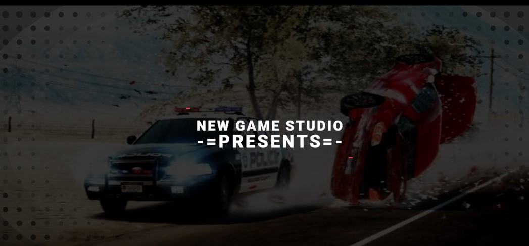
A picture doesn't do it justice, but there's some early testing of some pretty sweet little animations and transitions. It's just the start of what can be achieved later when I hit the polishing phase, but, this is quite nice for now!
Next up is my fancy new loading screens. Just like the logo animations, there's much more that can be added and adjusted to enhance the visuals, but this is a good start, I think! Check it out: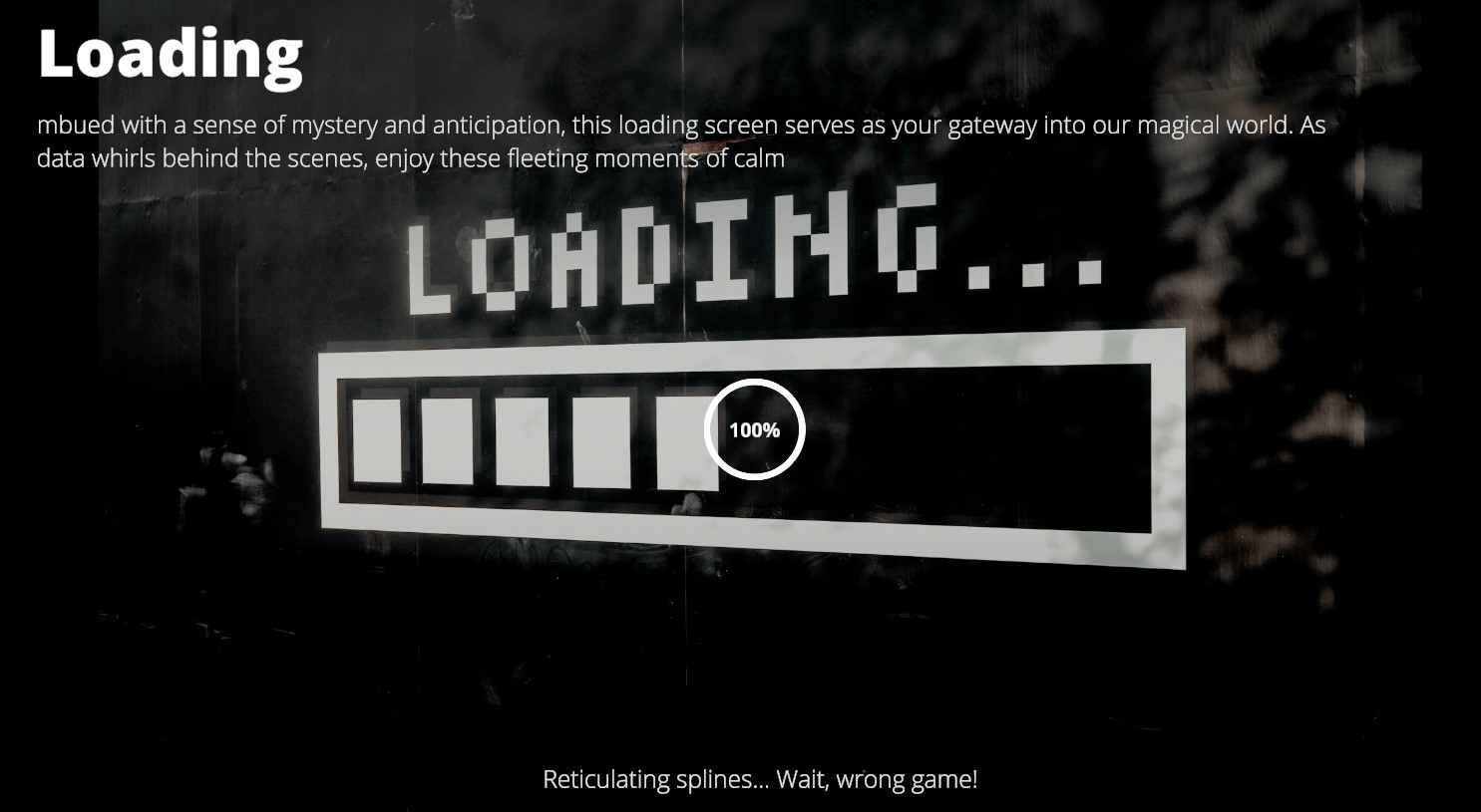
And there's a working progress bar that does represent the actual load progress as opposed to a made-up wait time! It's pretty good:

There's an example circled in red. Be sure to enjoy them while you observe the loading screens!
Then the big enchilada - my new beautiful main menu! Check out the welcome screen:
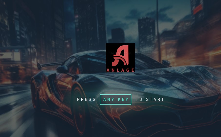
...And don't miss a sneak peak of my new studio logo! It's a WIP, but it's something... The menu is actually quite expansive, and there's a surprising amount of placeholder stuff that works - even the credits! Most of all that content is from the example scene that came with the asset, so now begins the process of replacing it with my own stuff and re-skinning it, but I think you'll find it's a VERY nice UI. Some of the settings actually work, too:
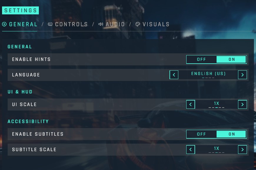
Here, you can see general options and it's interactable and mostly functional! You can even, for example, change the language:
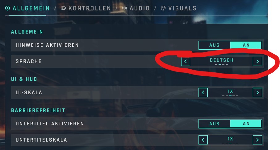
The Menu came with a Localization class that powers this, and by default the menu actually supports a few languages (that they made, so if anything is wrong, blame them, lol!) As an experiment I started to fiddle with the system and added Spanish as a language, and made a few translations with googles help. The translation is nowhere near complete - you'll see some text doesn't change because I haven't provided the translation for it, and, you'll also probably find mistakes if you speak the language. The point of it is, there's a lot of customization that can be done in a very easy way. So I expect great things to come with this menu.
The only thing that I really "hooked up" on the menu is the Play button, which does send you into the same old test scene, which now features crappy graphics! ..It's only because I was in the middle of fiddling with FSR and kinda left things at a low quality for now! There's menu that I disabled that will provide options to set the FSR and fix those visuals, just the menu is a bit crashy at the moment!
Lastly, there is a quick mock-up of a discord bug reporting tool! Press F5 during the race to see it - and do bless the mess, it's very early on... but it works! Check it out:
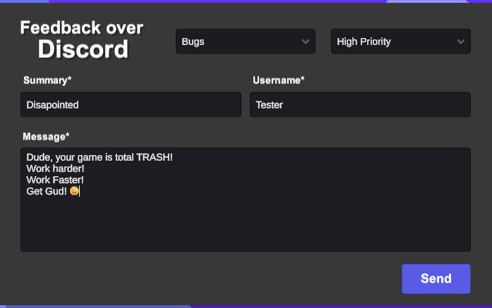
Here you can see the in-game form, and when you hit send, my discord alert goes off and I get information like this:
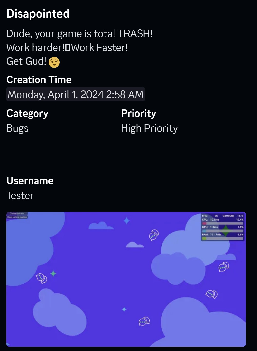
..And this:
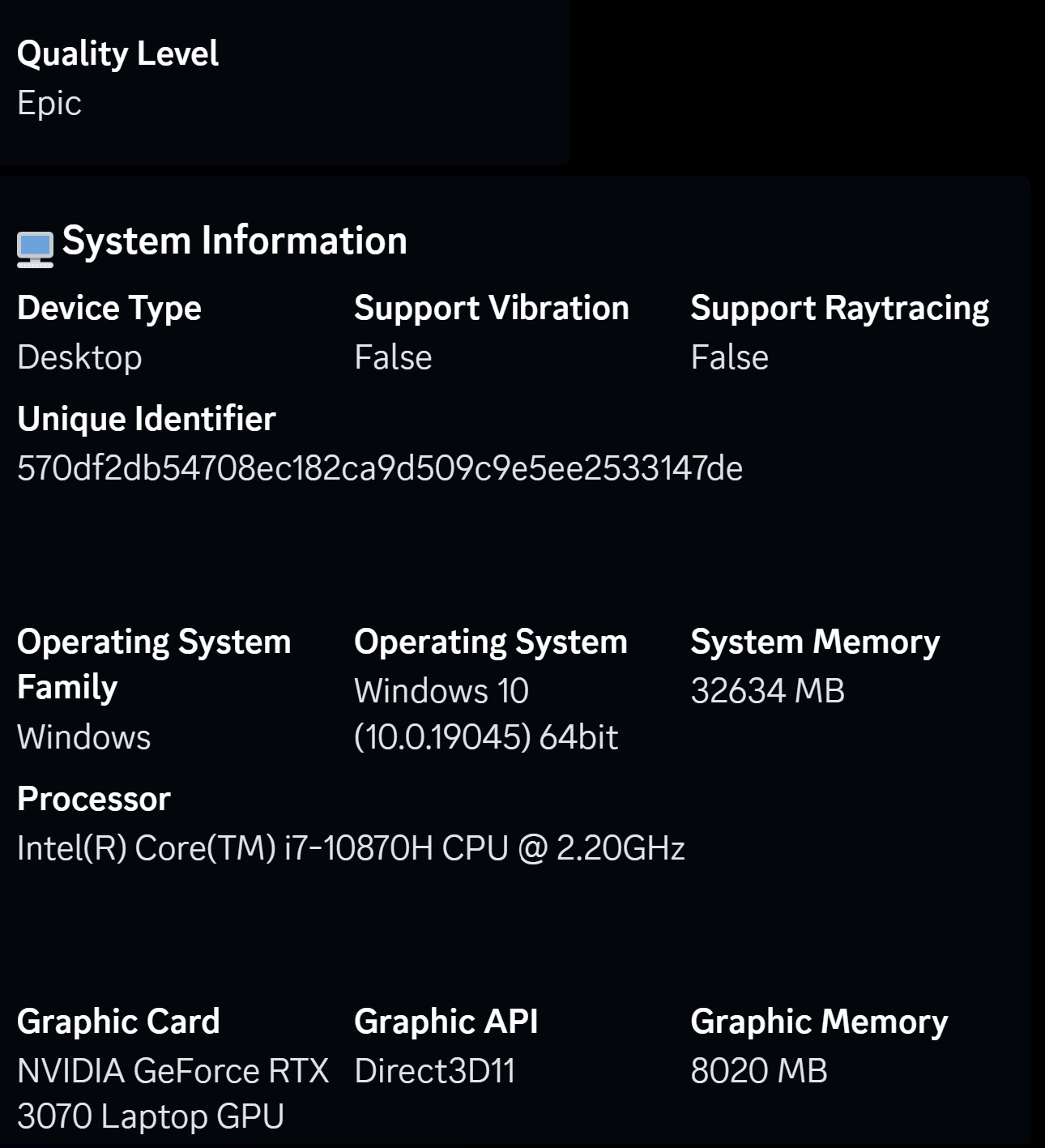
...As you can see, I get a screenshot along with info about the device it was running on, as well as some logs - all sent to my discord! That's pretty sweet, I think.
Again, this discord form is BUGGY. Once you press F5 your stuck on it and you'll never get to go back to the game again. But it is stable enough to allow you to type your feedback and send it. Try it ! (Please!)
That should be enough babbling for now. Next up is some test music and sounds. I plan to do a little on the racing for a bit, then to keep things fresh, I'll work on the menus for a bit, So I plan to progress all elements of the game together for now - because everything needs SO much work, and I don't wanna blow my load and burn myself out on any one thing at this early stage.
Keep an eye out for v0.0.5 coming mid April !
Get BeachRacing
BeachRacing
More posts
- 0.0.3 - Not An Update, but a special request!Mar 20, 2024
- 0.0.2 - FPS, Clouds, And SoundsMar 18, 2024
- 🏁 Hello World Race Fans!!! 🏁Mar 17, 2024
Comments
Log in with itch.io to leave a comment.
DUDE, get sleep! You're babbling on like you haven't slept in days, lol!
😀 👍